Tuesday, 14 December 2010
Monday, 29 November 2010
Photoshop Skills - History Tool&Gaussian Blur


Tuesday, 23 November 2010

Tuesday, 16 November 2010
Survey Results
Survey Results
- Are you male or female?
Male – 6 Female – 7
- What is your favourite type of music?
Rock – 7,Pop – 6,Indie – 2, Dance – 2
- Who are your favourite bands?
Simple Plan, Mcfly x4, Michael Buble, A Day to Remember , The Pretty Reckless, N-Dubz, Linkin Park, Nine Inch Nails, Placebo, Jimmy Eat World, Daughtry, Westlife, JLS, The Saturdays, Oasis, Kings Of Leon x2, One Direction, Paramore x2, Panic at the disco, U2, Snow Patrol, You Me at Six x2, Lady Gaga
- Does the music listen too influence your fashion style?
Yes – 1 No -12
5. What is your favourite clothing brand?
- Other than music, what else are you interested in?
Sport, music, drawing, socialising – every answer.
- Which features of a magazine do you prefer?
News – 9 Features – 5 Reviews – 0 Interviews – 6
- What convinces you to buy a magazine?
Front Cover – 9 Articles – 7 Price – 1
- What would the features of your ideal front cover be?
Celebrity – 7 Half Naked Man – 7 Half Naked Woman – 3 Sportsman – 4 Car – 0
- How much are you willing to pay for a magazine?
Under £1 – 2 £1-£2 – 4 £2-£3 – 3 £3+ - 5
These results show that the majority of people who did my survey were male; I posted my survey on facebook and twitter so I think that this is down to the amount of people who were online at the time.
The results show that the majority of people who did my survey prefer to listen to rock and pop music, so it suggests to me that I should base my magazine on the rock and pop theme.
The majority of bands that were listed as favourites come out as rock bands, so it suggests that I should feature some rock bands in my magazine to grab the most attention.
The results show that the majority of people who did my survey do not influence their fashion style on their music choices, so it shows that I shouldn’t focus on just one fashion style in my magazine.
My results show that other than music, the people who took part in my survey are also interested in sport and socialising, so it suggests to me that I should also feature these features in my magazine.
The majority of people prefer the news in magazines, so it suggests to me that I need to include lots of news updates in my magazines, also interviews because that was the second preferred feature.
Most people said that the front cover is mainly what persuades them to buy a magazine, so I need to make sure that my front cover is appealing to readers.
The results show that an ideal cover for most people would be to have a celebrity of some sort featured on the front cover, perhaps a cover line advertising a feature with them in.
Most People stated that they would be willing to pay over £3 for a magazine, so I think that I should reasonably price my magazine between £1 and £3.
Sunday, 14 November 2010
NME Front Cover

Masthead - Bold Font,Red.LargeFont.
Image - Reprsents 'Rocks Messisest Bust-Ups', the main feature of the front cover and the magazine. The image is of oasis, the jackets that the brothers have been photographed in match the house style, which is red and black.
Cover Lines - Large bold font, spread out across the front cover. The bold font can perhaps represent the characters that are Noel&Liam gallagher (oasis) - they come across as quite bold/confindent/cocky people. The cover lines feature the names of some specific artists that are featured in the magazine, which will target a specific audience because if soemone sees the magazine in a shop and notices that one of their favourite bands are featured in the magazine, they are most likely to buy the magazine.
The colours that have been used are pretty much the main colours that represent NME (red/white/black), so thorugh outthe front cover you can kind of tell that it is an NME frontcover because of the colours and the font also that has been used.
Some of the words that have been used seem to be targeting the magazine audience as young people and people who are fans of rock music. Words such as 'dude' have been used, and you associate the word 'dude' with young people. The fact that the main artocle is 'Rocks messiest bust up's' targets people who like to listen to rock music because it features rock bands, bands that the specific audience would be interested in reading about.
Q DPS


On the second page of the DPS, it is an image of the band, this has been used so that the reader knows who the article is focused on. The article is portraying the band as being quite strange and out of place and the image used agrees with the theme becausein the picture that has been used the band are holding guitars the wrong way up and they are pulling quite serious facial expressions,which are quite strange things to do so the image is helping to display the band .in the light that the magazine wants to focus on.
The pull quote that has been used also fits in well with teh theme because it is a member of the band calling them a 'band of misfits' - misfits being a word to describe someone as not fitting in and being quite strange.
A drop cap has been used - (where the first letter of the first word is huge) to grab the readers attention. The drop cap is one of the first features that you notice so it helps in wanting to make the reader read on.
The tone in which the journalist is writing in is to capture teh attention of a younger audience because some of the words used, such as 'misfits' could be described as slang, which an older audience perhap wouldnt really understand what some of the words mean.
Thursday, 11 November 2010
NME Contents

The pictures used represent the main features of the magazine. The page numbers are clearly displayed making the contents page an easy read. The house style is quite boring, black text with a white background, this is so that the images are what really grab your attention – they are the main focus.
The pictures have been used to emphasise the music theme, they are images of the artists featured. Also quotes have been used to draw the reader into that particular article.
The contents page is based on one page also to make it an easy read.
This contents page is not like the usual classic magazine contents pages. It mainly contains picture but it has a small amount of text.
The way the contents page has been set out seems to sum up NME as a whole because it is a bit different from other music magazines, for example it doesn’t just contain music, it also contains film, television and sport.
Sunday, 7 November 2010
Q Contents page

This contents page seems to have a balance in pictures and text. Perhaps to satisfy both modes of readers - readers who prefer to look at images and those who prefer to read text. The pictures have large page numbers to make it clear for readers to navigate around the magazine.
Mode of adress - Easy to understand basic language. Displays the magazine as an 'easy read'
Graphics - Has the main magazine house style, e.g red/white/black. All captions underlined with a bold red line so that they stand out, there to be noticed.
Q Front Cover

Fonts – There are 2 different fonts. One is big and bold, to grab your attention from what else is happening on the front cover and the other is to
Colours – There seems to be a certain house style throughout the front cover which is White, Red and Grey. These are usually the main colours on each of the magazine issues.
Pull Quotes – 'I Bought 50 Tins of Beans and an Axe' this quote is quite a bizarre quote fromt he main feature, and the caption underneath describes him as being out of control, so the quote fits in nicely with this because it is a quote thats is describing him as being out of control.
Main Image – Also ties in with the star being out of control because he is pictured trying to smash things up with a guitar, whic is quite an out of control 'Rockstar' thing to do.
NME DPS


The article is about Oasis, in which the two brothers are enemies. The article makes the enemy theme known in ways for example like the two brothers are pictured opposite eachother, like as if they were in a boxing ring. Some of the font is coloured red to perhaps to represent blood? Also there are either blood splats or tear drops just above the masthead. The pull quote used also emphasises the enemy theme and conflict between the brothers because it is either Noel or Liam expressing their dislike for their brother.
Tuesday, 2 November 2010

Monday, 1 November 2010
Mix Mag Contents Page Analysis

Contents Page: Uses pictorial and textual.
The two pictorial features are used to emphasise the whole laid back theme, for example its trying to send readers a message such as don’t dwell on the days bad events, go out and have fun. That message also ties in with the whole laid back magazine theme.
The page numbers are clearly set out.
Mix Mag has its contents page clearly set out on one page, the features that the magazine is particularly based on have both pictorial and textual definition. The images are used to draw the reader in.
Mix Mag Front Cover Analysis

The image represents the Swedish House Mafia as being quite relaxed and laid back because of how they have been photographed; they are not wearing any shoes, they are dressed in white and wearing sunglasses which suggests that they are comfortable and relaxed, that they don’t have a care in the world.
The way the Swedish House Mafia have been presented would appeal to the magazines target audience because it is a music magazine, and people usually read magazines when they are relaxed, so it ties in with the whole laid back effect.
The information about the main article is situated in the left third, the area which when the magazine is on a shelf you will be able to see clearly.
Above the main article it says ‘The Stars of Ibiza 2010’. This links in with the main image because it suggests that the image has been taken in Ibiza . Also the Swedish House Mafia has quite a ‘dance/club’ style to their music, so it also ties in to the Ibiza setting because Ibiza is known for its nightlife.
The Skyline immediately informs you on the genre of music that the magazine is based around, which is dance.
Monday, 11 October 2010
Front Cover Evaluation.
I do not think that my front cover is very good at all. Some reasons for this are that i have never used photoshop before, so my skills are very limited when it came to designing the front cover on photoshop and when i designed my front cover i did not have a very creative eye, so i didnt really think about a certain styles that would run through the magazine, i basically just went for random colours and fonts, which looking at my front cover now has in my oppinion just made it look a mess, so i now know that in future i need to really think about the certain style ( colours of font, styles of font etc) that i want to run thorugh my magazine. I think that i could have changed the colours of my font to the three colours featured on the models t-shirt because then itperhaps would have looked a bit better and i would have had some sort of style.
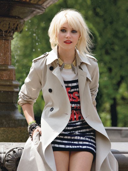
 This is the image that i used for my front cover. I think the good aspect of the image is that the t-shirt that the model is wearing in the picture has the brand name dispalyed but however not very clearly. So i need to change the positioning of the model so i can see the main feature clearly.

This is the font that i used and designed on dafont.com. I designed this particular font because i liked how it was very bold and seems to make a statement, which also i think ties in with the fashion theme because the idea of fashion is to make a statement, so i do think that this is one of the aspects of my magazine that actually went well.

The lighting in the picture is not fantastic, it distracts you from the main feature of the image in my oppinion, so i need to work on the postioning of the model in the sense of lighting, i think i should take the picture in a different place, for example in the college tv studio as i took this picture at home.
This is the font that i used and designed on dafont.com. I designed this particular font because i liked how it was very bold and seems to make a statement, which also i think ties in with the fashion theme because the idea of fashion is to make a statement, so i do think that this is one of the aspects of my magazine that actually went well.
Thursday, 7 October 2010
Contents Page

College Magazine - Front Cover

Tuesday, 5 October 2010
Masthead Designs

Images that have inspired me.


Front Covers that have inspired me .


Monday, 4 October 2010


Tuesday, 28 September 2010

Thursday, 16 September 2010

Subscribe to:
Comments (Atom)