Monday 11 October 2010

Front Cover Evaluation.

I do not think that my front cover is very good at all. Some reasons for this are that i have never used photoshop before, so my skills are very limited when it came to designing the front cover on photoshop and when i designed my front cover i did not have a very creative eye, so i didnt really think about a certain styles that would run through the magazine, i basically just went for random colours and fonts, which looking at my front cover now has in my oppinion just made it look a mess, so i now know that in future i need to really think about the certain style ( colours of font, styles of font etc) that i want to run thorugh my magazine. I think that i could have changed the colours of my font to the three colours featured on the models t-shirt because then itperhaps would have looked a bit better and i would have had some sort of style.

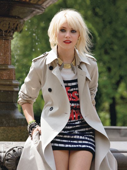
 This is the image that i used for my front cover. I think the good aspect of the image is that the t-shirt that the model is wearing in the picture has the brand name dispalyed but however not very clearly. So i need to change the positioning of the model so i can see the main feature clearly.

The lighting in the picture is not fantastic, it distracts you from the main feature of the image in my oppinion, so i need to work on the postioning of the model in the sense of lighting, i think i should take the picture in a different place, for example in the college tv studio as i took this picture at home.


This is the font that i used and designed on dafont.com. I designed this particular font because i liked how it was very bold and seems to make a statement, which also i think ties in with the fashion theme because the idea of fashion is to make a statement, so i do think that this is one of the aspects of my magazine that actually went well.

Thursday 7 October 2010

Contents Page

This is my finished contents page. I tried to stick with my idea on my flat plans for the contents page but because this is my first time using photoshop, i found it a bit difficult to find the correct tools to use to create the original flat plan image. I have used the chosen background in all honesty because i forgot how to change the background colour, so i was playing around with some of the photoshop tools and found this bubble effect. I do no think that this really makes my contents page look very good but i thought that because my magazine was supposed to be fashion based, i thought it went with the theme because bubble wrap is a material that in some cases is used for outfits.

College Magazine - Front Cover

This is my finished front cover. I have never used photoshop before so i found it quite difficult to design an amazing front cover. I dont think that my front cover looks very good but i tried my best, my photoshop skills are very basic so my front cover is a very basic design.

Tuesday 5 October 2010

Masthead Designs


I have designed a variety of fonts on http://www.dafont.com/, i was experimenting with the different types of font to see which would suit my magazine best. I particularly like the Bold designs because i think they are more eye catching rather than normal or itallic designs.

Images that have inspired me.


These images have inspired me because i like the effects such as the black and white but i also like how emotion is portrayed in the poses that the models have used.

Front Covers that have inspired me .


These front covers have inspired me because i like the way that they are set out. I especially like how the the image can overlap the mast head and how the cover lines stand outin the way that they are styled.